conférence · Vendredi 19 octobre 2018
Between Baskerville & Didot: Messine
Jérôme Knebusch
In 2011 students from ESAL Metz,
in combination with Argentinian
type designer Alejandro Lo
Celso and their teacher Jérôme
Knebusch, began work on a
specific design for their school.
Looking for a bookish typeface
with a tendency toward modern
forms, the students found particularly
interesting references to
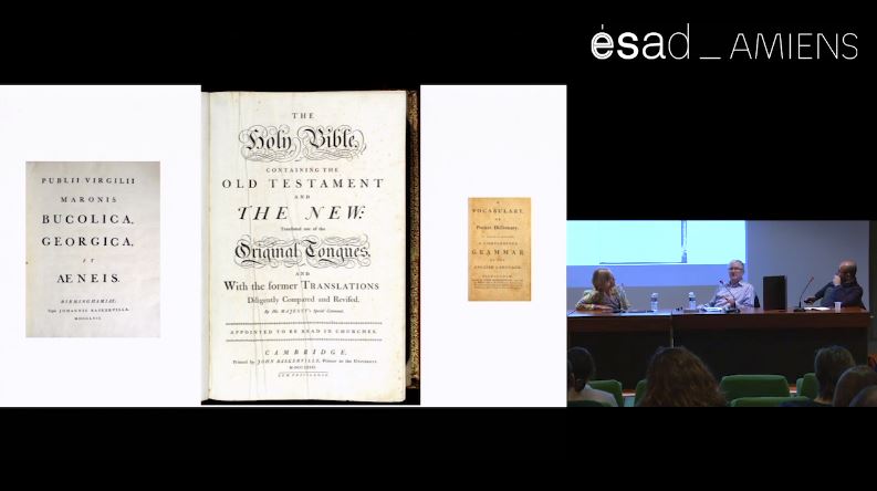
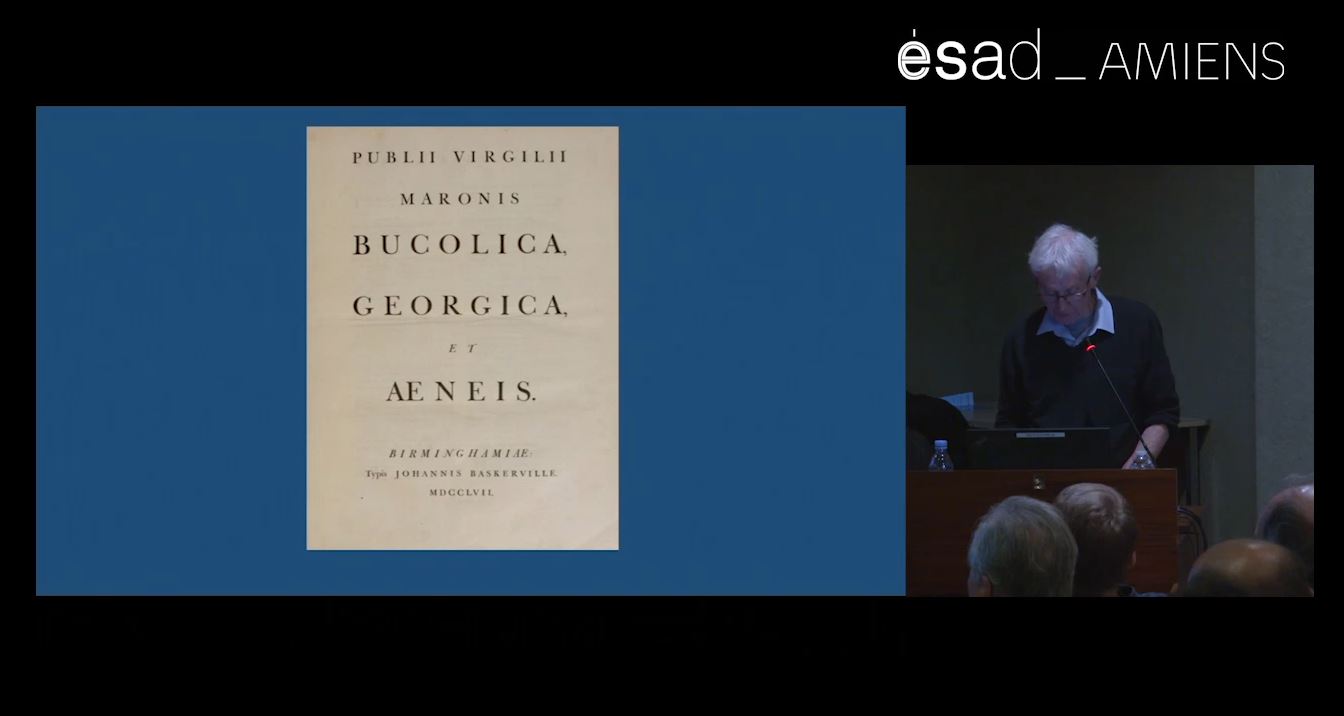
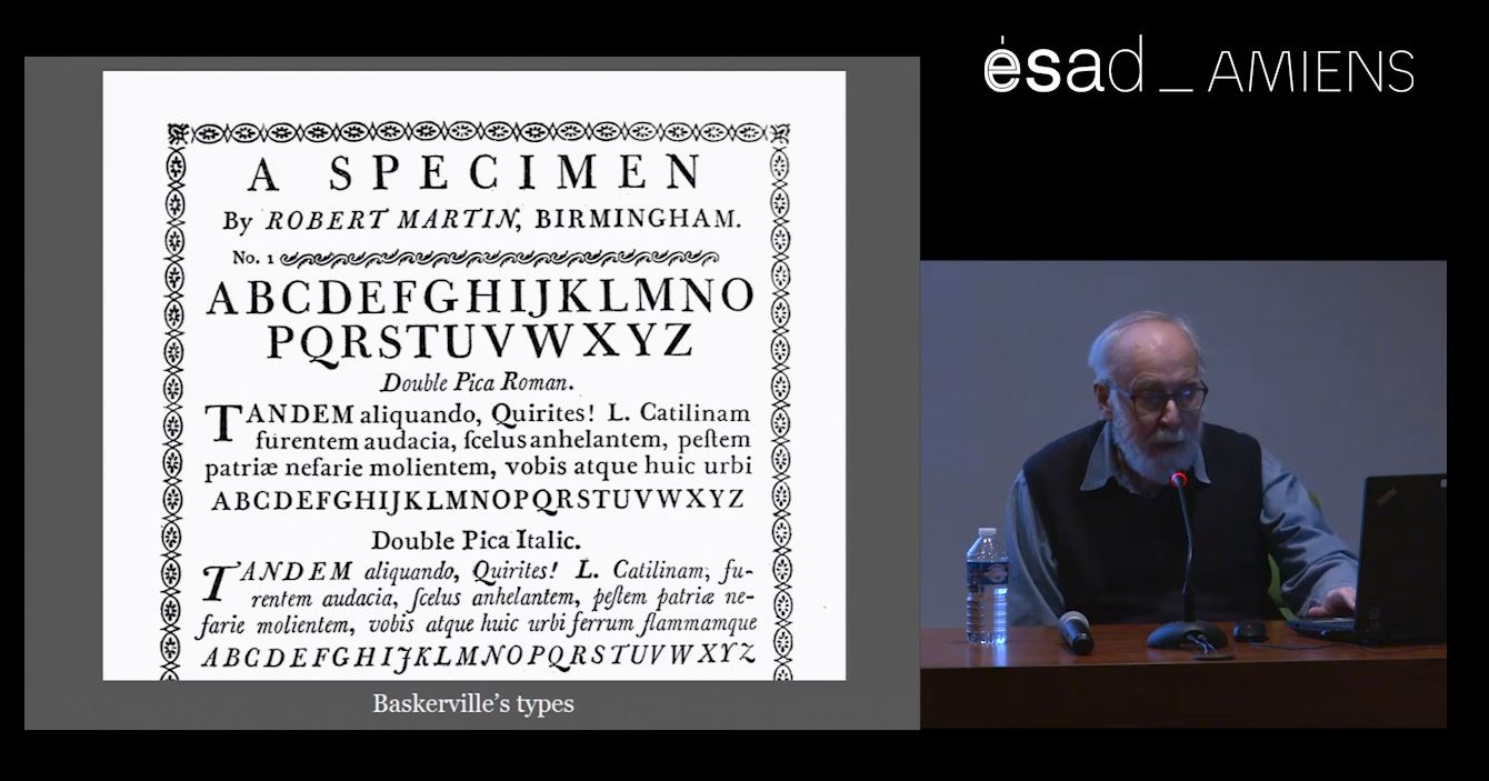
the work of Baskerville and Didot.
The typeface developed, over the
ensuing years and during intensive
workshop sessions, to form
a complete type family named
Messine, which included text,
display, poster, italic, bold, sans
and serif versions. This talk will
go back to its genesis, show the
evolution of the design (not afraid
of historical giants) and discuss
pedagogic and type design
methodologies of an on-going
inter-generational project.
in combination with Argentinian
type designer Alejandro Lo
Celso and their teacher Jérôme
Knebusch, began work on a
specific design for their school.
Looking for a bookish typeface
with a tendency toward modern
forms, the students found particularly
interesting references to
the work of Baskerville and Didot.
The typeface developed, over the
ensuing years and during intensive
workshop sessions, to form
a complete type family named
Messine, which included text,
display, poster, italic, bold, sans
and serif versions. This talk will
go back to its genesis, show the
evolution of the design (not afraid
of historical giants) and discuss
pedagogic and type design
methodologies of an on-going
inter-generational project.
- Manifestation
- Baskerville in France (2018)
- Disciplines
- Typographie